AI Can Make a Beautiful Picture. So Can a Hotel Lobby.
The first second is doing a lot of unpaid labor


The useful test for an AI image is not whether it looks good. At this point, that is like asking whether a casino has lighting.
Of course it looks good. The machines have learned the entire decorative emergency kit: wet armor with a hard rim light, misty fantasy cities, luminous faces blurred into expensive melancholy, neon puddles reflecting a future nobody can afford. They can produce “cinatic,” “surreal,” “melancholic,” and “beautiful” at industrial speed—which is to say, they can produce the visual equivalent of a trailer for a show that has not been written.
The real question is harsher:
After you recognize the vibe, is there anything left to look at?
Too often, no. The image gives you one concentrated hit of atmosphere—ah, sad knight; ah, haunted cyberpunk lady; ah, enormous castle having feelings—then dissolves into the enormous digital landfill of other sad knights, haunted ladies, and emotionally available castles.
That is what people mean by “AI slop,” though the phrase is less a technical diagnosis than a smell test. Slop is not “anything made with AI.” Plenty of human beings have made slop with cameras, paintbrushes, Adobe suites, and budgets large enough to qualify as small governments.
Slop is what happens when an image knows the signals of significance but has nothing particular to signify.
A thousand details, none of them acquainted
Consider the standard prestige-image warrior:
-
Rain
-
Ornate armor
-
A torn banner
-
Lowered sword
-
Dramatic blue-and-orange light
-
Face of someone who has just remembered the subscription renewal
Every object is screaming IMPORTANT. None of them appears to know why it is there.
The banner means “war,” the sword means “defeat” or “melancholy,” the rain means “this is not a fun war.” But why this banner? Why this wound, this weather, this exact posture? What happened before the frame, and what changes after it?
If the answers are “nothing” and “nothing,” then you do not have a scene. You have a pile of emotional refrigerator magnets.
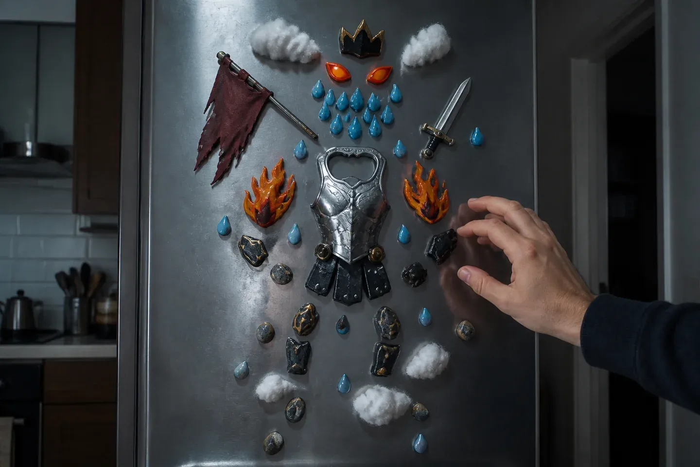
Some assembly required. No story included.
| What the image contains | What it often actually says |
|---|---|
| Torn banner | “War has occurred somewhere nearby” |
| Glowing eyes | “Please take this seriously” |
| Perfectly muddy face | “This person has suffered photogenically” |
| Fog | “We could not think of a background” |
| Cinematic crop | “The adjective is now the idea” |
There is nothing wrong with visual convention. Religious painters used shared symbols. Genre painting returned to familiar scenes. Pop art, photography, collage—all repeat images and make that repetition matter. Decorative art is allowed to decorate. Fandom work, erotica, concept design, wallpaper: nobody needs to submit a dissertation before drawing a dragon.
But polish is not proof of meaning. A beautifully furnished stock-photo room is still replaceable by another beautifully furnished stock-photo room. That is the problem: not ugliness, not AI, not even repetition. Replaceability.

Luxury, now available in twelve emotionally equivalent finishes.
The machine can generate options. It cannot care which one survives.
An image model has no internal reason to prefer this misty castle to the 600 misty castles beside it. It is excellent at extending familiar associations. Ask for “melancholic cinematic warrior in rain” and it understands the assignment with the grim competence of a wedding-DJ algorithm.
What it does not supply is stakes.
Those have to come from somewhere irritatingly human:
-
A decision about what the image is actually about.
-
A constraint that makes certain choices necessary and others wrong.
-
A willingness to reject the prettiest version because it is saying nothing.
-
Revision, the ancient and inconvenient practice of returning to a thing after the applause has stopped.
This is why an awkward photograph can haunt you longer than a technically flawless generated portrait. Its strange crop, overexposure, empty chair, or battered family object may belong to a real encounter, a real place, a memory with splinters in it. The flaw is not automatically profound—people have been mistaking bad craftsmanship for authenticity since at least the invention of the unwashed poet—but it may be specific. Specificity is where the image stops being decor and begins making demands.
Leonardo’s Mona Lisa does not endure because of secret codes smuggled through the Renaissance like forbidden parmesan. It endures because the expression, gaze, hazy sfumato, and winding landscape make looking unstable. The portrait withholds. Picasso’s distortions in Guernica are not failures to render bodies correctly; they are part of how catastrophe arrives on the canvas.
The point is not “be Leonardo or Picasso.” That would be an extremely annoying takeaway. The point is that in consequential work, form is doing more than dressing up the furniture.
Prompting is not directing, much as the prompt box would love you to believe
A prompt can be useful. It can be a thumbnail sketch, an audition, a color study, a way of finding possibilities quickly. That is real. It lowers the barrier to rendering a plausible image, which is not nothing.
But “I typed a beautiful sentence and selected the least alarming output” is not the same as making an artwork. It is closer to casting a very expensive lottery ticket that happens to contain elves.
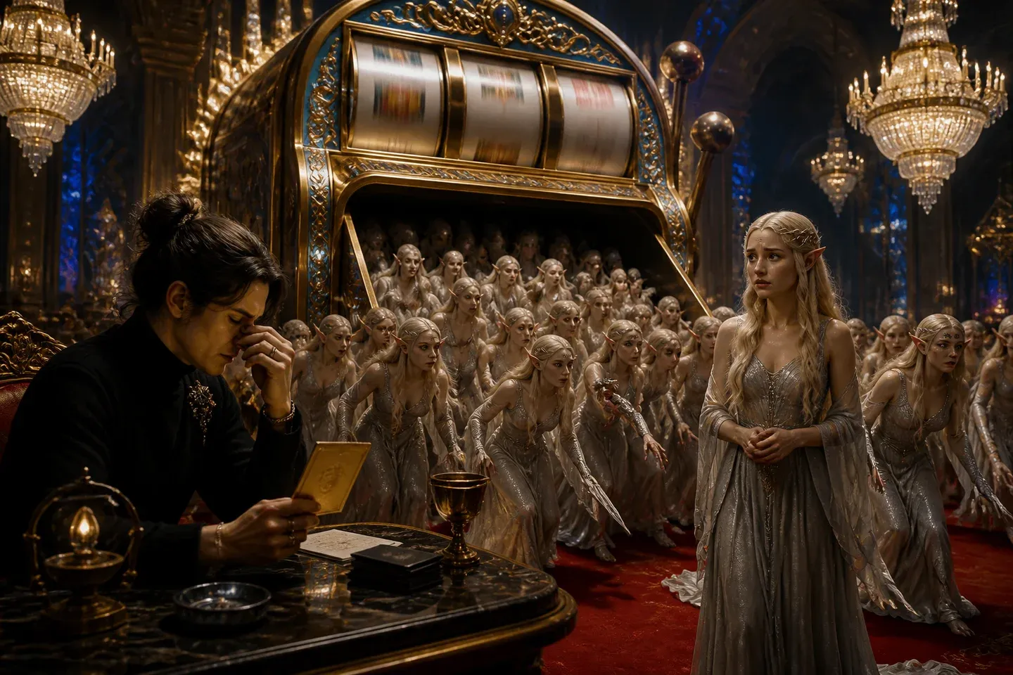
The house keeps the better elf.
The questions have to arrive before the prompt:
-
Whose point of view is this?
-
What tension must the image hold?
-
What detail cannot be swapped out?
-
What must the viewer notice immediately?
-
What should remain unresolved?
If a project concerns migration, vague “ethnic” texture and an interchangeable foreign city will not do. Architecture, routes, garments, family objects, absences, and particular histories matter because they make the image answerable to actual people. Where identifiable communities are involved, so does consent. Research is not garnish. It is how an image avoids turning somebody else’s life into mood-board confetti.
Fiction needs this discipline too. A visual bible can establish recurring spaces, material references, costume logic, palette rules, and motifs. If a coat gets more worn across a sequence, it should tell us something about weather, time, class, or the bad turn life has taken. If a room is always lit from one side, breaking that rule can mean danger has entered. Or safety. Now the light has a job.
The red boat is the difference
Imagine five images of a flood evacuation. A child’s red plastic boat appears first as a toy at home, then as a flotation object during the evacuation, then rests in a memorial tree.
AI can help stage the crowds, weather, rooms, and aftermath. Fine. But it does not independently decide the boat matters, carry it through the sequence, or notice when one version turns it into irrelevant red plastic clutter.
That arc exists because somebody made choices and then enforced them. The boat is not a symbolism asset. It acquires meaning through recurrence, change, and placement. By the end, it has a past.
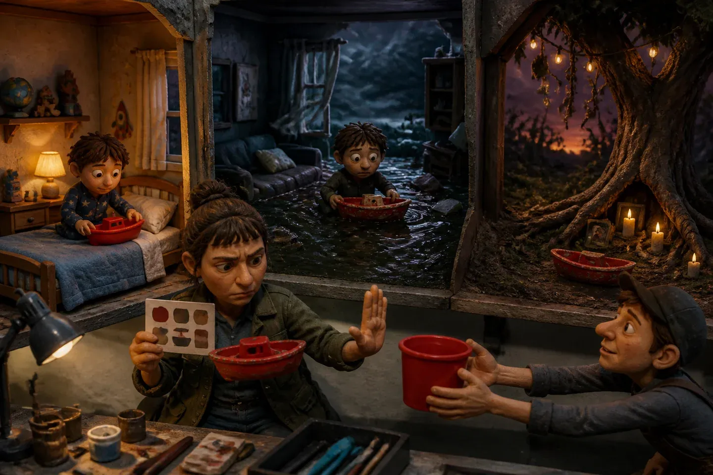
Continuity is just sentiment with a clipboard.
The same goes for malformed hands, contradictory reflections, unreadable signs, and accessories that seem to have been designed by a committee of hallucinating raccoons. A technical error is not always fatal. But when it remains because nobody bothered to return and make the image cohere, it announces the larger problem: nothing in this frame was ever asked to belong to anything else.
Tools such as sketch, pose, depth, and edge guidance; image-to-image variation; inpainting; compositing; paint-over; typography; 3D blockouts; and color grading can give a maker more control. They can separate composition from character reference, material treatment from final correction.
They cannot supply judgment. They just make it possible to fail with better menus.
The ethical question is not a decorative border
There is also the minor matter that these systems are not neutral hammers found lying in a digital shed. They reflect choices by developers, datasets, platforms, and institutions, and they draw on vast stores of cultural and artistic material.
That makes questions of living artists’ styles, copyright and provenance, identifiable people, consent, biased representation, labor effects, disclosure, and computational scale part of the work—not a little compliance sticker applied after the cool image is done.
Responsibility does not sit only with individual creators. But individual choice does not vanish because the machine has a shiny interface and a button marked Generate.
The cheap thing is rendering. The expensive thing is attention.
AI has made convincing imagery cheap and plentiful. Congratulations to everyone involved; the internet now has enough rain-soaked warriors to invade a medium-sized country.
What remains rare is discernment: knowing what to show, what to withhold, what to research, which gorgeous output to throw away, and which detail must stay because removing it would collapse the whole meaning of the image.
So ask more than whether an image fools the eye.
Ask whether its gesture, setting, symbols, and framing exert pressure on one another. Ask what traditions, labor, and borrowed material made it possible. Ask whether it rewards a second look—or whether it spent everything it had in the first second.
Because as beautiful surfaces become cheap, the achievement is no longer making an image that looks like it matters. It is making one that cannot be replaced without losing something.
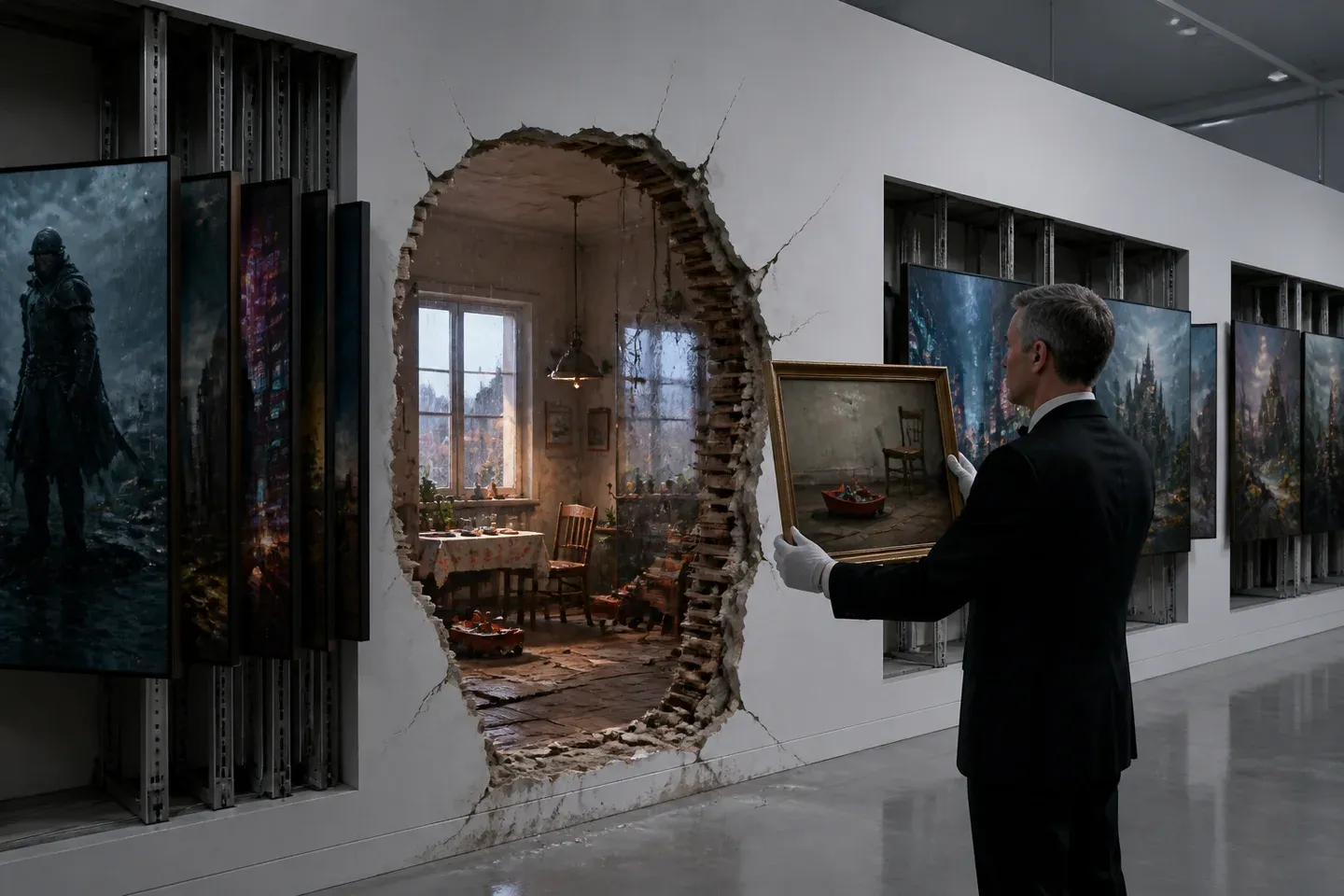
The generic ones came with spare parts.